Are you an Android developer and love the site? Contact us
updated (Apr 14, 2024)
Map Help
Need help? Try a Turbulence Forecast by Email
Hello! When I forecast a flight, I typically use International / Atlantic Europe 1 (or the Polar Atlantic ones, the same map but a bit more to the north), as it covers a wide area and is easy to interpret. The main items on this map are the following:
- Green arrows - these indicate the jet stream, a fast moving river of air. Typically you'll see some light bumps along the jet stream. If you're flying in the same direction of the arrows, you'll typically fly right along side or with the jet stream to save fuel. Typically eastbound transatlantic flights will do this. If you're flying in the opposite direction, you'll avoid the jet stream as much as possible. You'll see this with transatlantic westbound flights, they'll usually fly north or south of the jet stream (within reason) to avoid the jet stream.
- Yellow bubbles - typically the jet stream alone without a yellow bubble around it means smooth to lightly bumpy. If there's a yellow bubble around an area, it indicates turbulence is forecasted. Sometimes you'll see the yellow bubble around a jet stream, and sometimes you'll see them in areas without the jet stream indicated. The single hat symbol by the legend for the yellow areas indicates moderate. A double hat symbol indicates moderate-severe. The number on top indicates the height of the advisory (add two zeros at the end to convert to feet). The height on the bottom indicates the starting altitude (again, add two zeros to the end to get feet). XXX means all the way to the ground.
- Red bubbles - indicate the chance for stormy weather. Anywhere from light to moderate to severe is implied in these areas. The four letter code on the top of the legend indicates the density of storms in the area. ISOL means isolated, typically less than half of the area covered by weather. OCNL indicates between 50-75 percent of the area covered by weather. FREQ indicates 75 percent or greater coverage of weather in the area, typically seen with a hurricane or other weather phenomenon.
- Europe 2 map - I also take a look at the Europe 2 map as it shows more low level weather phenomenon for Europe.
- For Middle Eastern / Asia Pacific flights I look at the India/Middle East map, also has the same basic setup.
With weather, I usually use a global weather satellite radar such as Windy.com to get a better idea of the storm affected area. I also look up flight paths with FlightAware.
For US based flights, I use the same Atlantic Map as described above. I also look at the Maximum Turbulence Potential Map for the US. I sometimes also look at the radar / echo tops for US based flights and occasionally the Weather Maps page for more color on why things are the way they are.
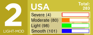
Finally, for US flights I look at the Pilot Reports of Turbulence and Turbulence Advisories. Sadly pilot reports are only available in the US. I distill all this information to give a decent idea of how a flight could be.